US eStore Website Optimization
Wacom is a globally recognized manufacturer of digital drawing tablets used across a variety of industries. Throughout my time at Roboboogie I’ve worked as the lead designer on Wacom’s website optimization engagement that is focused on increasing the overall site usability and conversion metrics through the use of A/B testing.

3D Product Detail Pages
UX / UI Design, 3D Animation, Photo Post-Processing
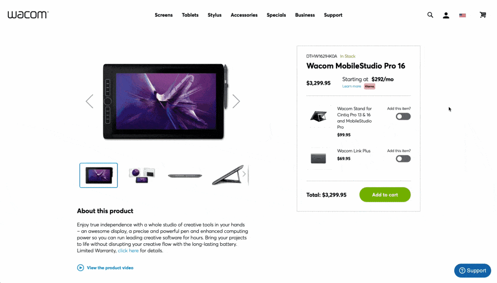
In an attempt to modernize the presentation of Wacom products, our client stakeholder was eager to experiment with using 3D renderings of the products to create a more immersive, informative experience. As lead designer on the project, I was responsible for the creative direction of the test which included partnering with a 3D modeling expert to clean up client-provided CAD models in order to create a sequence of scroll-triggered animations that displayed product information. This was a monster of a project that involved an entire phase of self-led training to learn 3D animation software in order to produce the work in-house. I quickly got up to speed with how to leverage the CAD models within Cinema 4D to produce completely custom 3D-animated vignettes that highlighted different hardware and software features for twelve of their most popular products.

2D Concepting Phase
Prior to committing to the full-blown 3D experience, we ran a pilot test leveraging 2D static designs within a reformatted PDP experience to gauge user’s interest in a more premium and modern design. After receiving positive testing metrics on the 2D experience we utilized the reformatted PDP design with the objective of replacing the static 2D block with a fully immersive scroll-triggered 3D animation section.

Model Cleanup
The first step in creating the 3D experience dealt with cleaning up the client-provided CAD models. Sensitive hardware information had been removed from the internal guts of the products (which was fine for our intentions), but there was a fair amount of cleanup needed to remove unnecessary polygons and apply first-pass materials.

3D Animation
Following the cleanup of CAD files came the 3D animation workflow. I had past experience creating 2D animations using After Effects, but stepping into the 3D animation world was an entirely new skill I had to develop for this project. My background in photography and experience with studio lighting was enormously helpful in setting up camera & lighting rigs that were used in tandem with keyframed position movements to achieve the desired look for each product sequence.
After hours of video tutorials, forum discussions, and trial and error I was able to successfully produce a series of 9-second vignettes, each consisting of three “viewpoint” milestones that would be paired with relevant information. All twelve of the selected products had to be individually created with their own unique sequence showing off the product which resulted in the creation of over three thousand individual frames that would be linked to the user’s scroll pattern within that section.
Development Build
Once the individual animation frames were produced, we were able to tie the animation sequence into a 3D element block that reacted to user’s scroll. If they scrolled down the page, it progressed through the sequence, and if they scrolled back up it reversed the sequence. This gave users full control of seeing the product pan, tilt, and spin in a curated movement that gave helpful product highlights matching each viewpoint in the sequence.
A variety of factors had to be considered given the heavy impact to page performance, and due to a limitation with current web standards and data usage we opted to create an alternate mobile experience that utilized static frames for each viewpoint. Although it would have been more satisfying to run the full 3D experience across all screen sizes, serving the best experience on any given device was the top priority and ultimately led to positive testing metrics across desktop and mobile.
Results
After serving 40k unique sessions, our 3D PDP experience reached an add to cart rate of 9.45% and almost $400k in attributed revenue.
Additionally, the experience caught the attention of the entire Wacom organization, resulting in a discussion around implementation to additional regions beyond the US eStore.
Vertical Category Page Display
A/B Testing • UX / UI Design
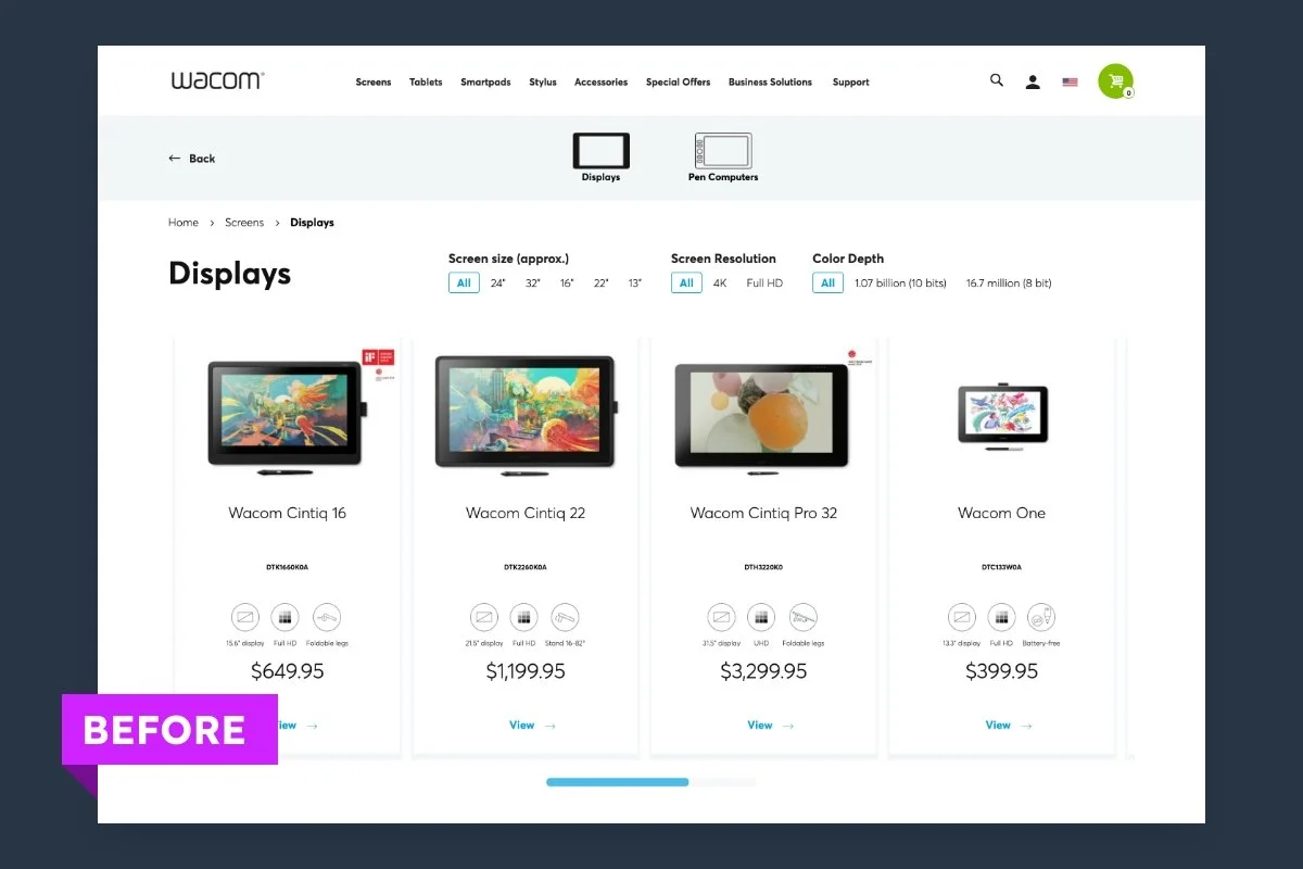
At the beginning of our engagement Wacom had just recently migrated to a new e-commerce platform which had been rolled out globally with segmented regional eStores. I’ve had to opportunity to test and iterate on the US eStore with successful tests being adopted across several if not all other regional eStores. One of the first tests revolved around restructuring the Category Page product display.
Before (Control Variant)
Rolling out a new template across a global audience comes with its challenges, and one area these issues spotted early on revolved around the usability of the category page. Individual product cards were placed within a horizontally scrolling module that could only be interacted with by clicking and dragging the small blue bar beneath the product cards and didn’t allow for any intuitive “dragging” of the cards themselves.
Additionally, product cards displayed a collection of less-than-helpful iconography that, although it benefitted the visual scanability of information, was visually repetitive and therefore wasn’t providing the value it should have.
Lastly, product filters rested above the product card section which not only would stay locked to the top of the page, but would load an entirely new page based on the selected parameters. This massively impacted the user experience as visitors needed to wait several seconds before the new selection had loaded.

After (Winning Test Variant)
Taking into consideration the pain points called out in the control variant, we opted to restructure the layout of the page to display product cards in a vertically scrolling wide layout. This allowed us to eliminate the unusable horizontal slider in favor for a continuous vertical scroll experience, which helped bring visibility to products hidden below the fold versus being stuck in the slider element.
This reorganization also gave us the opportunity to relocate the product filters into a persistent sidebar that follows users down the page. Our dev team also rebuilt the filter functionality from the ground up to accommodate an AJAX-style auto refresh of filtered products.
Lastly, given the extra real estate after converting product cards to a horizontal layout, we were able to introduce a short form copy block that gave a quick product overview instead of making users rely on iconography to differentiate product specs.
Results
After running the test for roughly two weeks, our team saw an additional ~$10k in revenue with an estimated yearly ROI of $170k. Due to the success of the test, we recommended implementation which eventually was rolled out globally across all Wacom eStores.
Working with Wacom has been extremely satisfying as a designer who was very familiar with their products prior to working together. I’ve loved assisting this industry giant and have been humbled by the impact my contributions have had on a global scale.