NordicTrack
Website Optimization • Email Campaigns • Landing Pages
NordicTrack is an at-home fitness company specializing in providing interactive training hardware that connects to iFIT, a library of live and on-demand training content.
As lead designer on the NordicTrack account at Roboboogie, I have worked extensively to provide strategy & designs that push the creative presentation of the brand and ultimately drive more conversions.
Treadmill Category Page Optimization
A/B Testing
The original category page template was an unsatisfying relic of several past design iterations and did a poor job of providing users with the context and functionality needed to effectively progress through the purchase funnel. The goal for this project was to reconfigure the page in a way that satisfied users’ needs while maintaining usability across all device categories.
Based on data insights gathered from previous A/B tests and FullStory sessions, our team identified two distinct audiences to cater to for this page redesign: The Goal-Oriented Customer, and The Exploratory Customer. While the two audiences arrived on the page with different motives, the solution presented provided a satisfying overlap of functionality that could accommodate both journeys simultaneously.
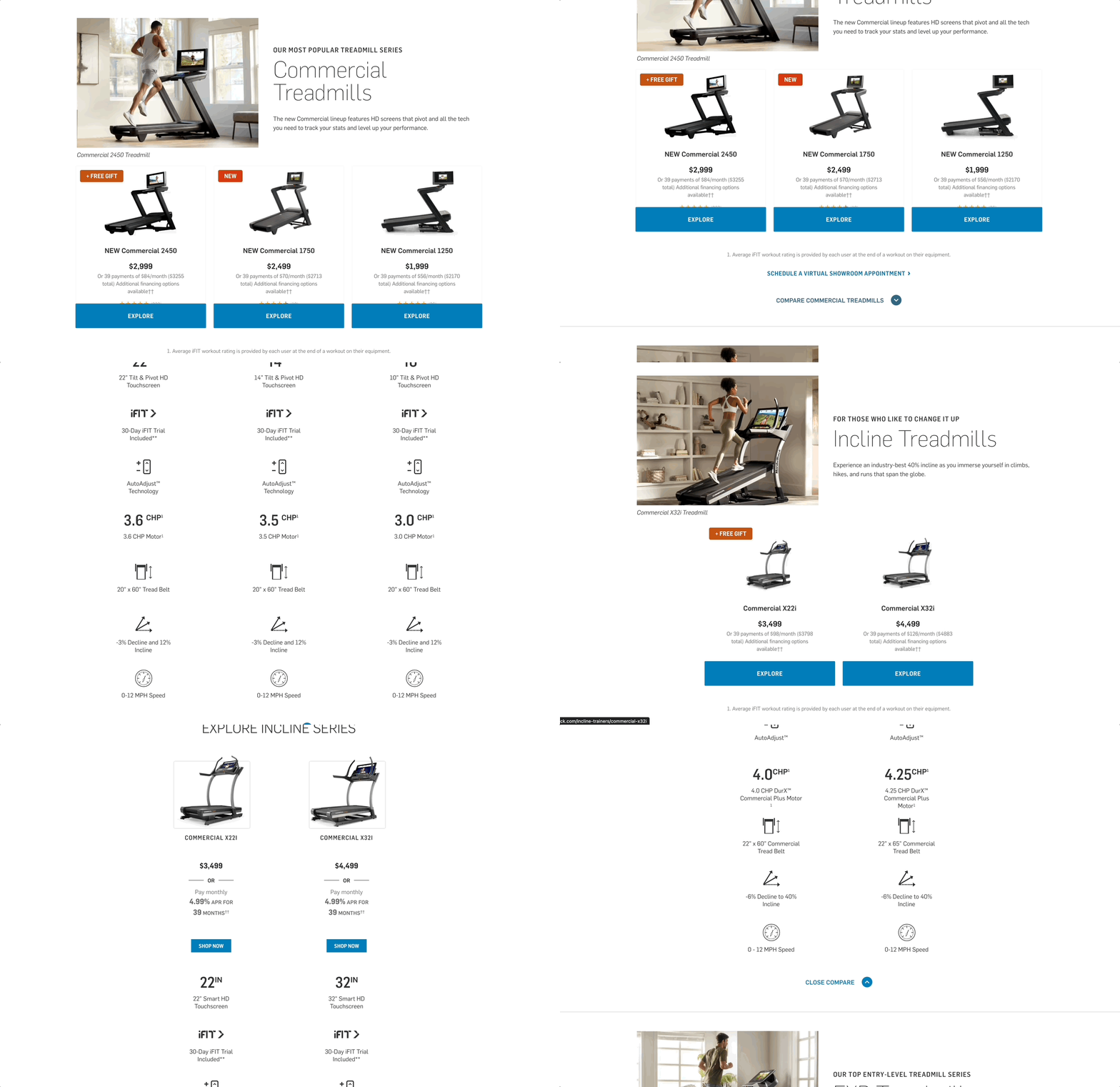
Original Layout: Narrative Sections
The original page design didn’t effectively utilize the amount of space it was occupying and required users to do quite a bit of scrolling to digest the content in its entirety. The page used distinct sections that introduced individual product “Series”, which are collections of products featuring similar attributes, although these sections didn’t effectively communicate A) the similarities of products within the same series, and B) the differentiators between series. Additionally, the page lacked any sort of filtering functionality that would allow users to find or discover products based on desired criteria. The original page design did include a “compare” feature, however it was hidden within an accordion style content drawer and only displayed comparisons for products within the same product series.
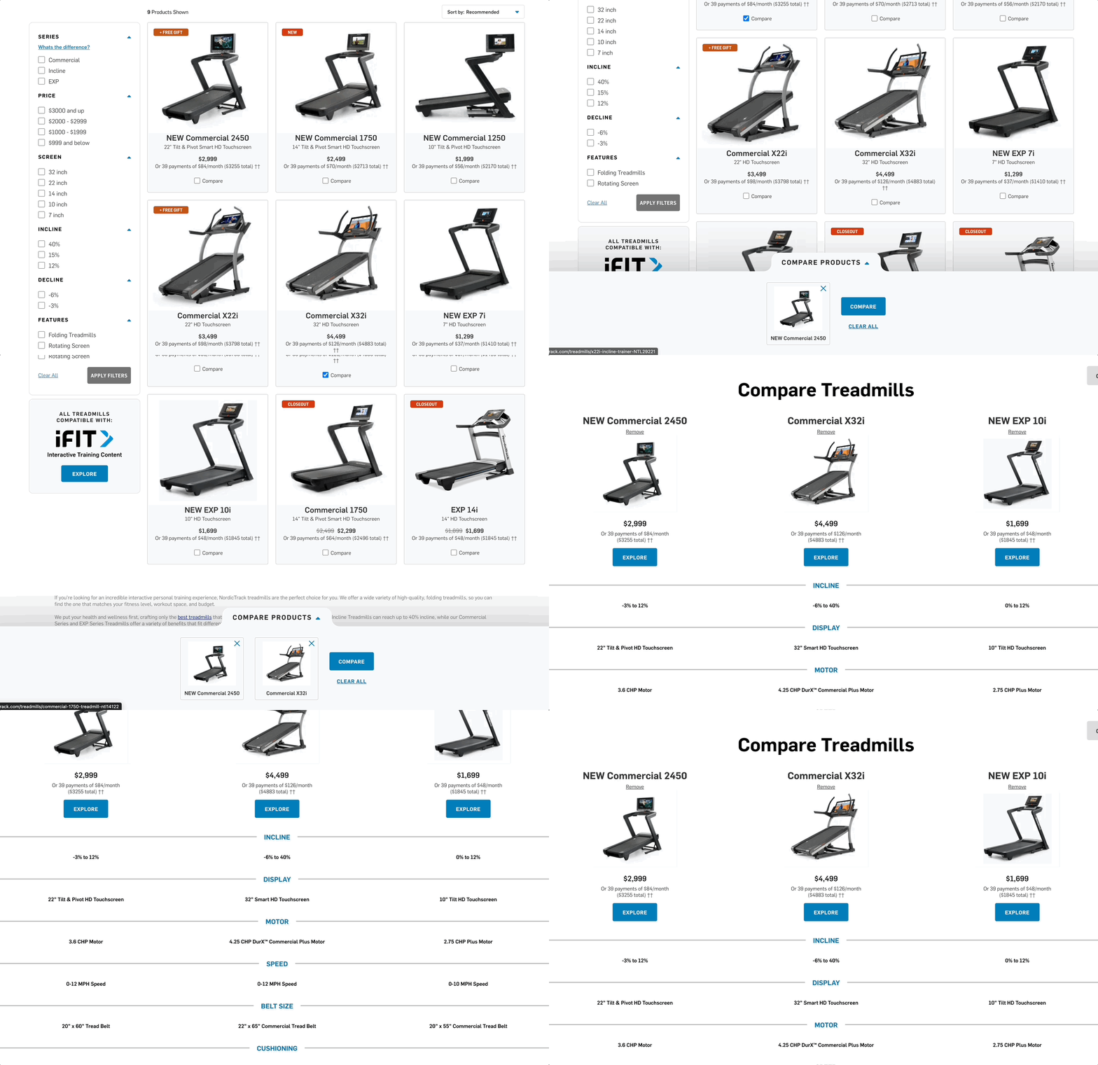
Redesigned Layout: Ecommerce Grid
In an effort to cater the page to the audiences identified in our data analysis, I redesigned the organization of this page to utilize a grid-style shopping experience that featured a filter sidebar where users could adjust specific attributes they were looking for (or discovering on the fly, such as “rotating screens”, an unconventional spec when shopping for treadmills). Additionally, a robust compare feature was added that allowed users to cross-compare on a product level, which our team felt was a crucial part of the exploratory shopping journey. Although this redesign deprioritized the distinction of “series” related information, the new layout allowed users to quickly find products of interest based on the user-friendly grid and filtering functionality (which included the ability to view all “series” information from the previous design).
Original Compare Functionality
Since the original compare functionality was series-specific rather than product-specific, it was located within a hidden accordion section at the bottom of each product series block. While the information it presented was valuable, it wasn’t the most intuitive user experience to discover and ultimately felt insufficient due to the inability to directly cross compare products within different series.
Updated Compare Functionality
“Compare” CTA buttons were directly added to each individual product card, making it clear to users that comparison functionality was available. Additionally, after selecting “compare” on a given product, a collapsable comparison drawer attached to the bottom of the page which allowed users to continue browsing until they found additional products to compare. Finally, users could proceed to a comparison modal that gave additional context to the specs for each product. The comparison modal also featured “add/remove” functionality that allowed users to navigate to additional products without leaving the comparison experience.
Results
Overall performance for this test indicated a significant improvement in user experience, as noted by a 130% lift in compare functionality engagement and a revenue increase of almost $200k throughout the duration of the test (~1 month).
One additional callout that I found interesting was a 6.76% drop in click-through rate compared to the original. However, the test variation also saw a 10% decrease in users going from the category page to a PDP and then back to the category page, which indicated that users who did indeed reach the PDP were more informed & educated on which product was right for them based on the information they digested on the category page.
Checkout Flow Optimization
A/B Testing, Moderated User Research Testing
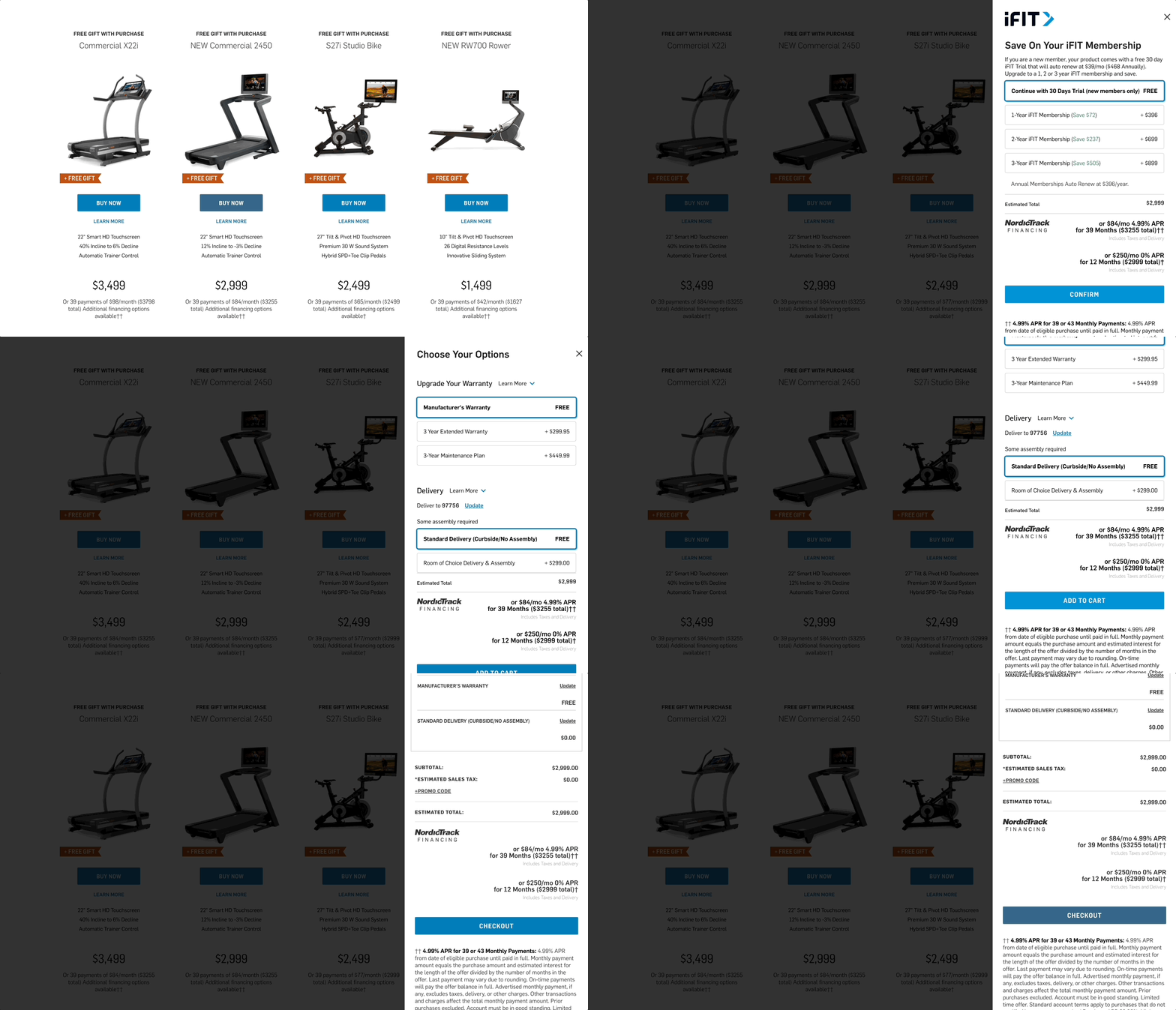
Originally upon add-to-cart, the NordicTrack site utilized a slide-out “sidebar” style mini-cart interaction. While this method allowed users to easily continue their shopping experience uninterrupted, the scalability of the design was limiting and required users to proceed through several “pages” of mini-cart states before continuing to the checkout pages. Additionally, the vast majority of users are only shopping for a single product given the average cost and nature of the equipment being purchased. I created a test design for an alternative post-add-to-cart experience that aimed to have an improved user experience with greater scalability, and aligned with the “premium” brand quality of NordicTrack.
Original Experience: Mini-cart
Although mini-cart experiences are commonly found throughout e-commerce shopping, it’s purpose on the NordicTrack site wasn’t working as well as it could have and created more issues anytime the client wanted to adjust or scale the experience. Most notably, the original mini-cart required users to click through a minimum of three separate “pages” of the mini-cart before continuing on to the checkout pages.
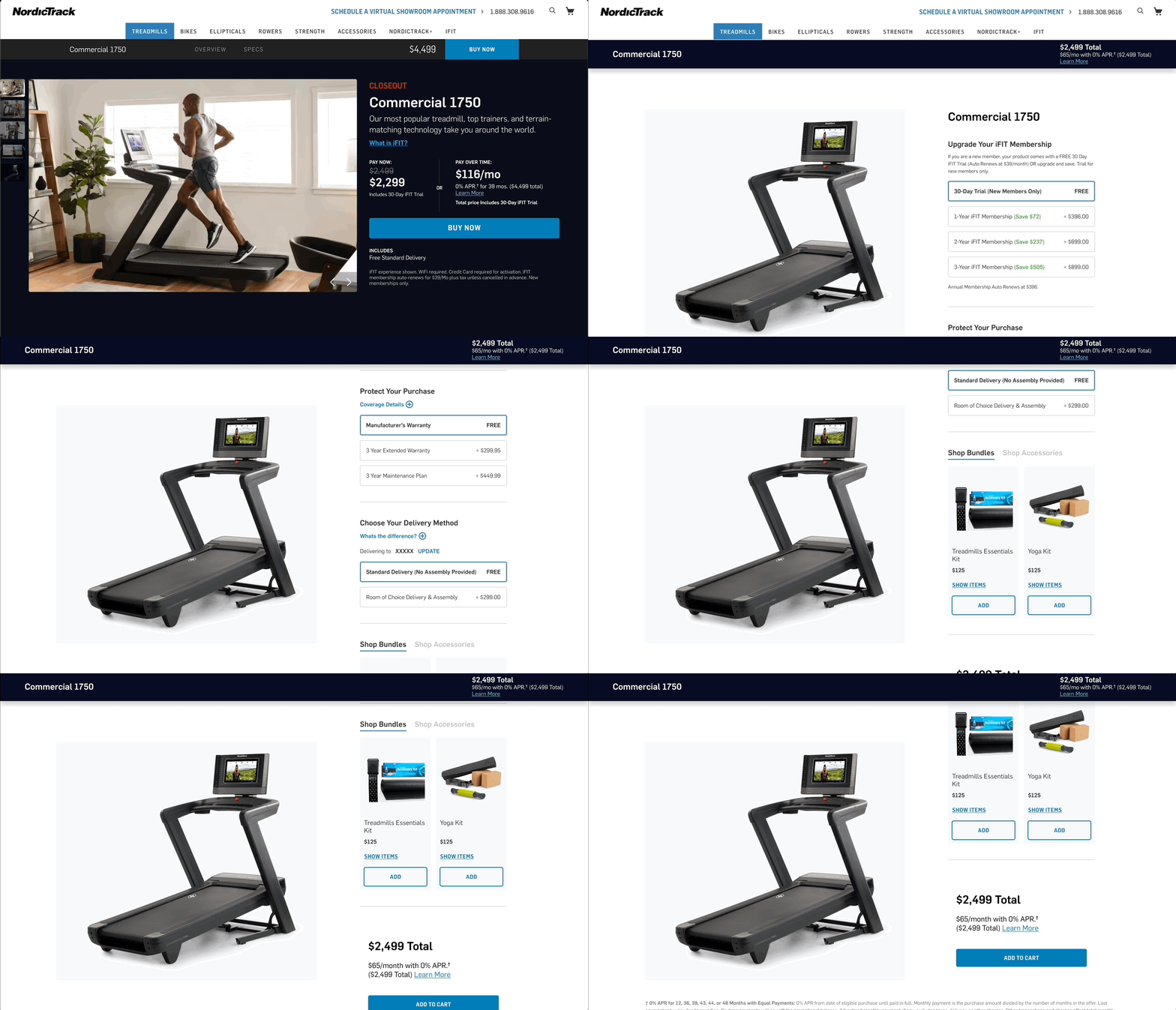
Redesigned Experience: Configurator
NordicTrack has a characteristically difficult purchase issue — given the nature of the product, users have the option to select a variety of upsell options including upgraded delivery, extended warranty, and the ability to upgrade their subscription to a proprietary content platform from a trial membership to a paid membership. Given the volume and complexity of add-to-cart functionality, I felt the experience would be better suited within a single page “configurator” design, where users could shop between upgrade options while keeping an eye on their running total package cost. With the shift to a single page configurator experience, I was even able to add an additional value-add upsell section that showcased popular & applicable accessories that could be added to their order.


