ProForm
Website Optimization • Email Campaigns • Landing Pages
ProForm is an at-home fitness company specializing in providing interactive training hardware that connects to iFIT, a library of live and on-demand training content.
As lead designer on the ProForm account at Roboboogie, I have worked extensively to provide designs that push the creative presentation of the brand and ultimately drive more conversions.

PF+ Category Page Hero Optimization
A/B Testing
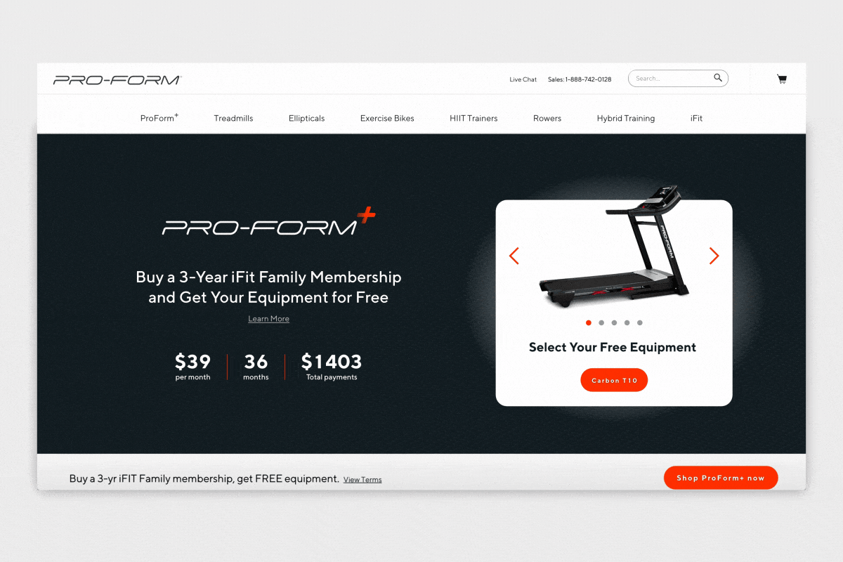
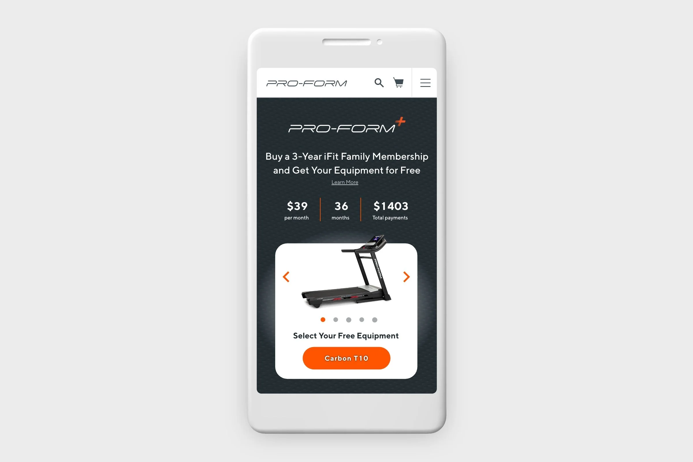
ProForm offers a special bundled service that allows users to receive a free workout machine with the purchase of a longer duration membership to its content library, iFIT. The original experience was entirely leveraged on a brand-anthem style video in the hero container that quickly explained the program with additional details following below the fold on the page. Our data showed that users who were properly informed of the details of the program resulted in higher conversion metrics which prompted us to serve a more interactive and info-rich experience in the test.
Our goal was to simplify the messaging in the hero element in order to jumpstart user’s awareness of the program before needing the additional context lower on the page. As lead designer for the project, I accomplished through concise copy treatments and an interactive carousel that allowed users to quickly flip through the available equipment they could receive as a part of this program.
Desktop Performance
A/B testing provides many wonderful insights that paint a picture for how users interact with the product. The PF+ Hero optimization test highlighted a key distinction between how desktop and mobile users digested the content on the page and therefore could be leveraged for future tests. Over the course of the test we found desktop users to be more receptive to the “scavenger” approach. Given the larger real estate of the desktop experience combined with more user control via hover states and the precision of mouse-clicking, users appeared understand the overall goal of the program much quicker than other audiences. This was reflected not only with a higher conversion rate than the control test, but also a reduction in redundant funnel metrics (i.e. visitors advancing to an individual PDP to learn more before converting) which signified that desktop users interacting with the test were getting enough sufficient data to support a purchase decision. Win!
Mobile Performance
Users visiting the test on a mobile device were served a similar experience tailored to their viewport, but painted a different picture than their desktop counterparts. The intuitive drive to click, drag, and swipe on a mobile device showed a 20% engagement rate with the product carousel which is an outstanding metric to be tied to a brand new page element. However, the conversion rate wasn’t justifying implementation on a mobile device, which our team took as a message that mobile users weren’t being served the information they needed to understand the program enough to justify a purchase. This could be attributed to a variety of factors, but the primary hypothesis is that mobile users were benefiting from the fast paced info-dump that was being provided by the video content in the control variant. Although mobile wasn’t a win, this was super helpful context to have knowing mobile users preferred quick, scannable content that provided more info in a shorter timespan to account for the slim window of attention as they scrolled through the site.
Results
This test saw great metrics for desktop users, resulting in an additional $55k in revenue during the test run time and a 20% engagement rate for the new carousel element. Although mobile users didn’t show the same bump in conversions, they reacted positively to the hero carousel element with a matching 20% engagement rate.
This test was a great example of an inadequate blanket approach that showed mobile and desktop users were requiring separate experiences to achieve the desired results.
Studio Bike Pro Mobile Landing Page
A/B Testing
ProForm has a strong paid media presence running ads across various social platforms, but are almost always directed at existing pages on their site which resulted in a nasty bounce rate. We hypothesized that serving paid media traffic with relevant landing page experiences would decrease the bounce rate and increase the add to cart rate as users followed a more consistent narrative from initial ad interest through to the site.
As lead designer for the project, I created two test variants for mobile ad traffic that served dedicated landing page experiences for the new Studio Bike Pro 22 product. The two variations followed a similar framework of content with different focuses on copy in an attempt to capture the attention of unique personas.
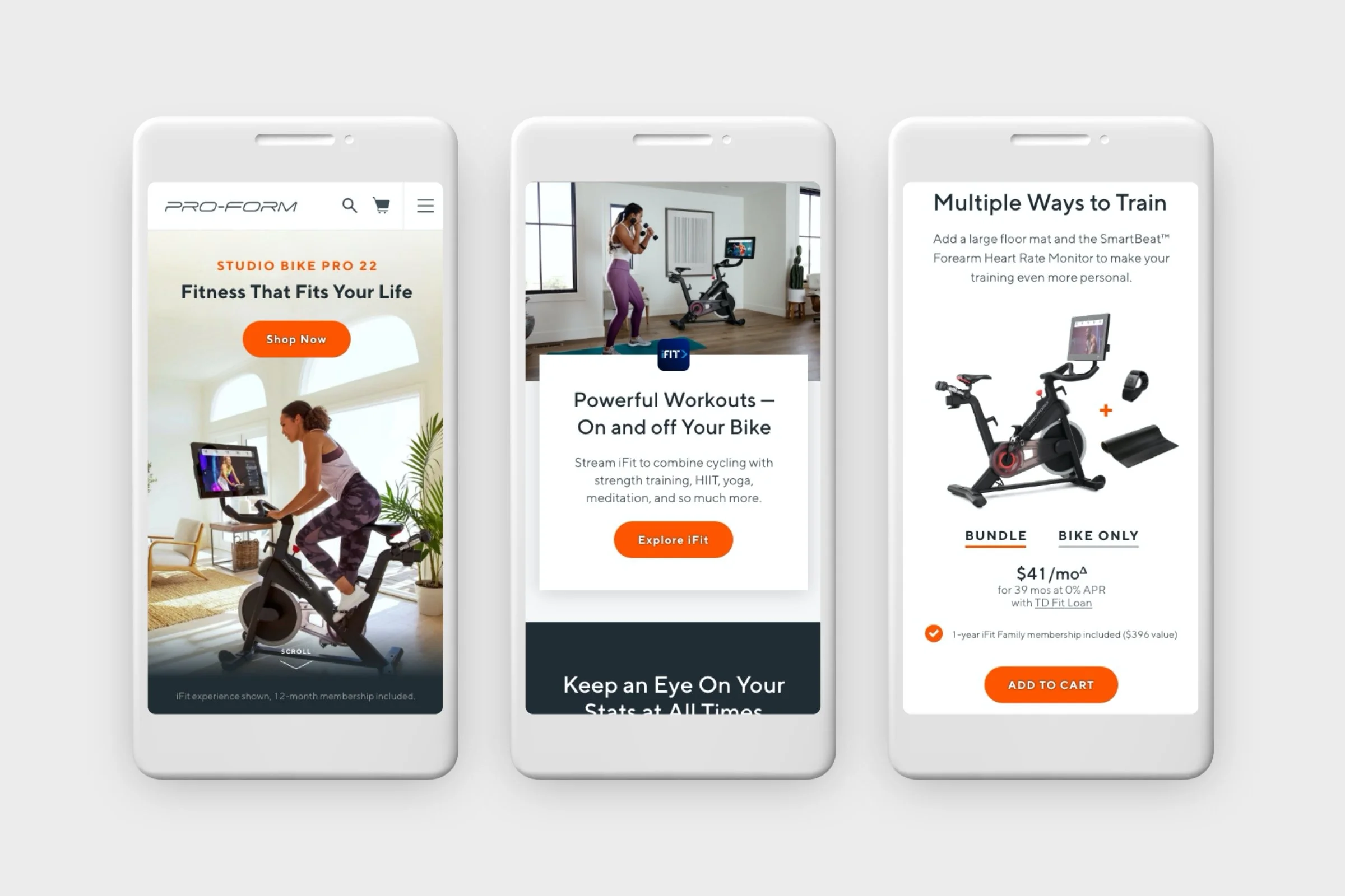
Focus on Versatility
Our data showed that users generally fell into two distinct groups, one focused on workout versatility and one focused on affordability of the product. For the “Versatility” test variant I focused the copy and graphics around referencing hardware and software features the benefited users’ ability to get more out of their machine. This landing page highlighted the expansive content library that allows for workouts to go beyond the limitations of the physical machine, in-app UI elements that give a variety of realtime workout stats, and a product upsell block that displayed the ability to expand workout capabilities with optional accessories.

Focus on Affordability
The variant that focused on affordability used the same UX framework as V1, but shifted the copy and imagery focus to speak towards product value and features that would benefit cost-conscious shoppers. This began with prominent financing details in the hero section, cross comparisons to gym membership costs, and an upsell block that gave users control of seeing a low monthly cost of adding bundled accessories.
Results
Both test variants saw great results with a decrease in bounce & exit rates. They also both saw a greater add to cart rate and conversion rate, leading to a cumulative revenue increase of $37K over the span of the test. These results confirmed the hypothesis around serving dedicated landing pages to paid media traffic.
Working with ProForm has been very satisfying not only for the client’s receptive nature to aggressively test new features on a constant basis, but also for the fact that their #1 market competitor, Peloton, has largely been the face of the industry which has created an exciting rivalry between the two companies. This has allowed for friendly competition to push each other to provide the best overall experience possible and has been truly rewarding as a designer who represents the underdog in a David vs. Goliath situation.