University of Oregon
I worked as the Lead Designer in the in-house marketing office at the University of Oregon Student Recreation Center. I directed a small team of student designers to produce social media content as well as digital and printed signage throughout the grand opening of a $50M expansion project serving an average of +6000 daily visitors. Other duties included event branding, photography, videography, and design for marketing collateral and giveaways (soft goods graphics, t-shirts, hats, stickers, postcards), as well as internal departmental collateral such as way-finding signage, nameplate badges, presentations, conference materials, greeting cards, commemorative plaques, and wall graphics.
CAMPAIGN DESIGN
Branded Events
One of the most enjoyable categories of work at UOREC was branding individual events. I thoroughly enjoy the process of branding for businesses, so event branding gave me the opportunity create a set of cohesive, familied assets that effectively communicated the personality of the event while maintaining regulations of the University brand guideline system.
One of my favorite projects I worked on was creating promotional content for the annual bouldering competition, Dirtbag Derby. I had an impactful role in this event as I contributed in a wide variety of ways starting with naming the event itself and establishing the main logo and overall brand identity to be used across additional assets. I also created a large collection of marketing collateral including digital screen ads, printed posters and handouts, stickers, hats, t-shirts, and even filmed and edited a highlight video to be used for promotional purposes.
PRINT DESIGN
Event Posters
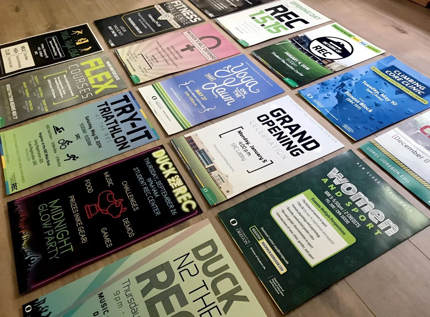
Prior to having the luxury of running digital screen ads, I designed hundreds of printed posters that were placed throughout the building. The posters effectively communicated the same type of information conveyed in the screen ads, but I gained a lot of experience dealing with the nuances of printed materials including setting projects up with cut & bleed marks, utilizing Pantone and CMYK color systems, and consciously selecting paper weight and stock options. This was also a great exercise in limiting the amount of information shown as we were working with mere seconds of focused attention as visitors walked past.
DIGITAL SIGNAGE
Digital Screen Ads
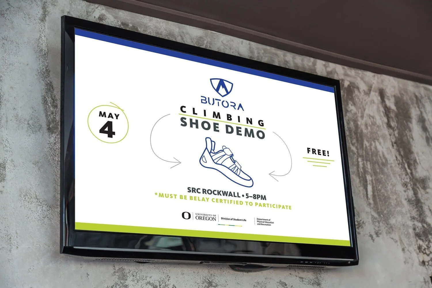
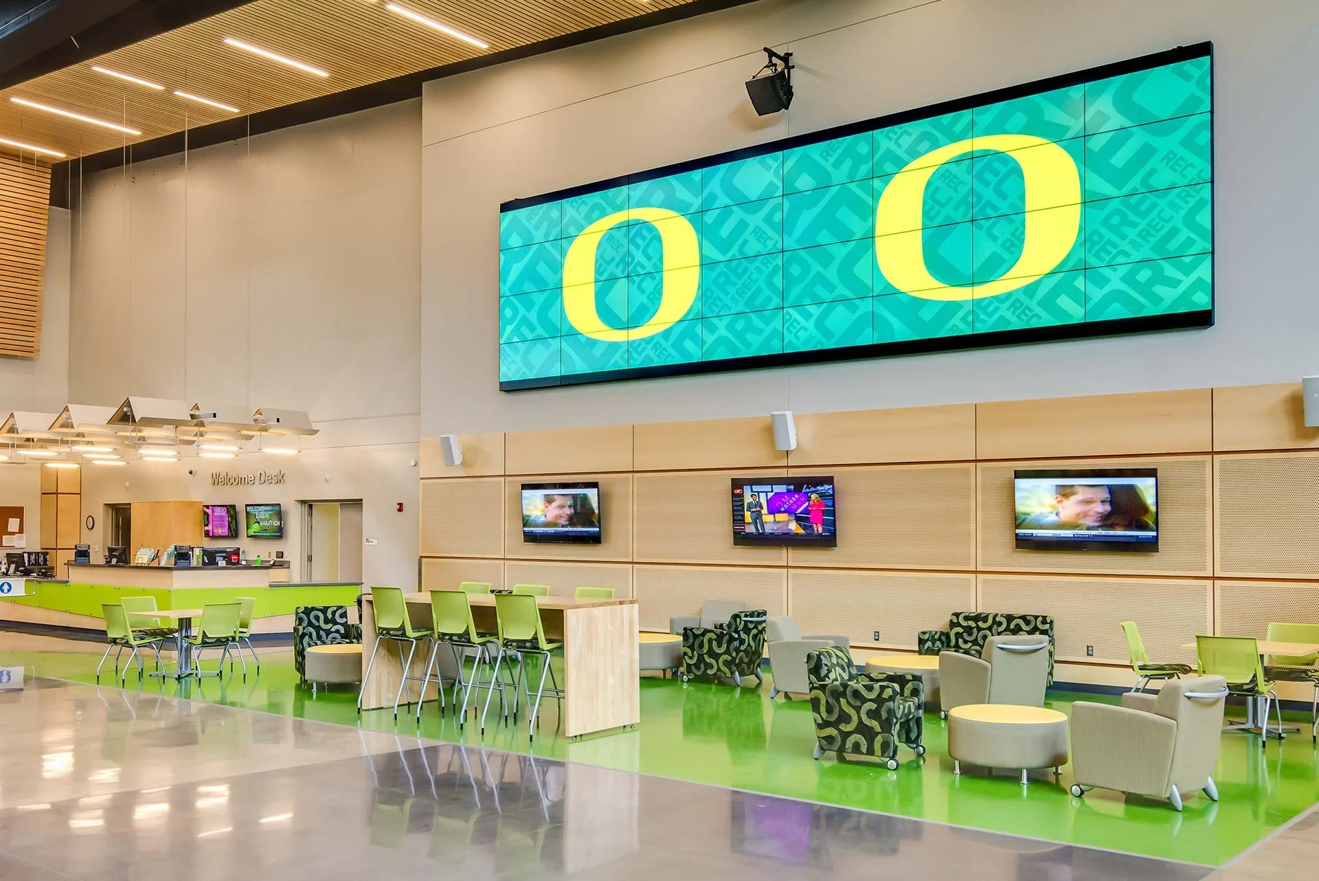
A constant and ongoing portion of the content I created for the UO SRC included digital screen ads. As a part of the $50 million dollar expansion project, sixty-eight large screen TV’s were placed throughout the building in order to cycle through promotional content that highlighted upcoming events and important notices. All screen ads needed to comply with the existing brand guidelines set in place by the Office of Communications, but otherwise were a creative exercise in translating any pertinent information in a visually pleasing and engaging format. Throughout my time in this position I created several hundred screen ads.
PROGRAM BRANDING
Webfoot Crossfit Branding
A portion of the $50 million dollar expansion project included revamping one of the fitness rooms to be specifically tailored to a new Crossfit program offered through the student recreation center. I designed the main logo for the new program, named Webfoot Crossfit which would then be used for all marketing collateral, wall graphics, and promotional giveaways. The program also went through the official Crossfit certification program in order to be a nationally accredited Crossfit program provider. The University of Oregon campus book store (“The Duck Store”) also currently sells multiple items of gear that utilize the logo I created for the program.
PROGRAM BRANDING
Duck Trails Kids Camp Branding
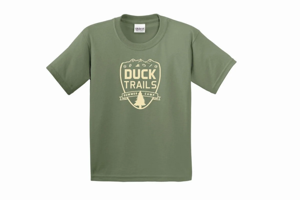
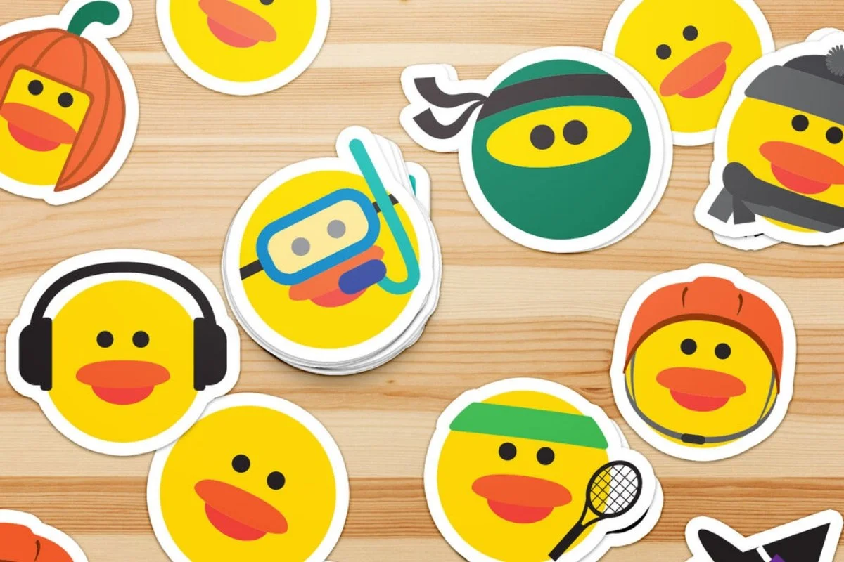
During my time at the UO SRC, the new youth program coordinator recognized the summer camp program had a lack of ownable personality that would greatly benefit the enrollment and participation of these camps, so she specifically requested to meet with me and my Director of Marketing in order to develop a brand identity for the program. I helped ideate, produce, and ultimately design the visual brand behind the new “outdoor school” themed program that was reminiscent of traditional summer camps where kids stay in cabins. I designed the main logo that was used for marketing collateral and the participant t-shirts that kids received at the camp. I also designed a series of themed duck “mascots” that represented the different types of camps that were offered such as tennis, rock climbing and swimming. These mascots appeared on theme-specific collateral and were additional turned into stickers that were given away to kids at each camp session.


