Impossible Foods
Website Optimization
Impossible Foods is a plant-based meat company that serves about 55% of the booming alternative-meat market. Throughout my time at Roboboogie I’ve worked on numerous web optimization projects for Impossible Foods aimed around increasing user knowledge about the company and products, as well as driving more conversions across their loyalty program and e-commerce site.

Impossible Locator
User Testing • UX / UI Design
Impossible Foods had outgrown their original product locator page and was frustrated by the consistent presence of bugs and errors. It also didn’t include any specialized functionality to support both their growing catalog of products, as well as their expansive partner network of featured retail stores. They were looking for a best-in-class experience that took those factors into account, all while needing to adhere to the API limitations of their Locator functionality vendor, StorePoint.
I worked as lead designer throughout the project which included a User Testing phase to ensure our designs were accomplishing the goals of the project.
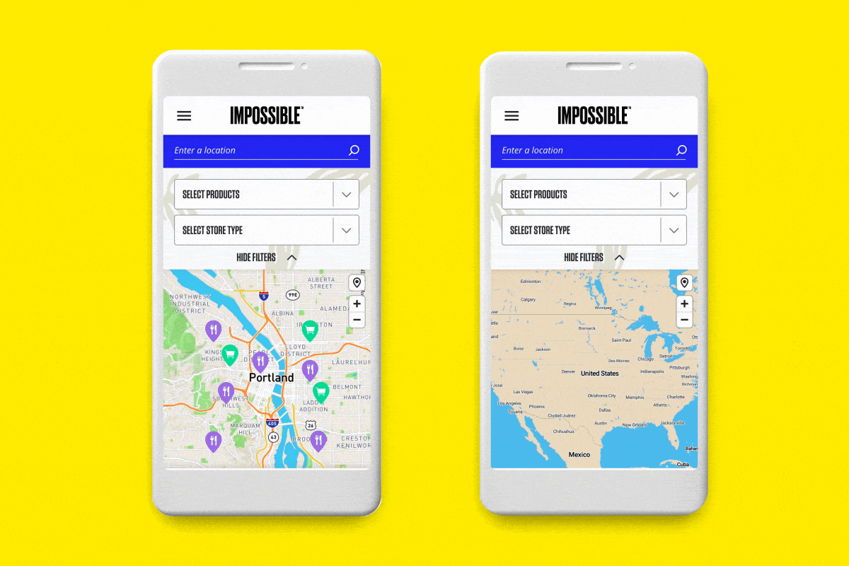
User Testing
Roboboogie had the opportunity to facilitate a User Testing pilot program that allowed us to stress-test the design and functionality prior to implementing to the live site. I worked as the lead designer and used Adobe XD in combination with UserTesting.com to build a high-fidelity clickable prototype using that allowed users to follow a series of prompts ensuring they could locate the information they were tasked to find. I collaborated with my internal team including our Director of Design, Sr. User Researcher, and Account Producer to produce a design that matched our user testing script.
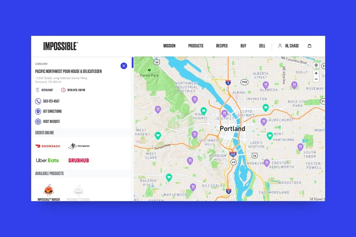
UI Design
The approved Locator design needed to not only serve a best-in-class experience, but also adhere to the API limitations of the Locator vendor. I cross referenced the goals of the project with previously built examples in order to deliver a final design successfully accomplished both. Although we unfortunately don’t have data that directly links our designs to converted customers, we were pleased to learn Impossible Foods saw an 85% spike in quarterly retail revenue following the implementation of our design, which I like to imagine was possible with the help of a useful product locator experience.
How would you rate the full store locator experience you’ve been shown in terms of difficulty?
“5 — Very easy, nothing extra. Everything you need is on the screen. Simple and intuitive. Everything is clear. Nothing needs to be added, nothing needs to be taken away.”
— User response during the Locator user testing phase
Impossible Product Landing Page
UX / UI Design
For the first several years of operation Impossible Foods was solely focused on perfecting their flagship product, Impossible Burger (made from plants). In order to accommodate growing catalog of new products offered by Impossible Foods, Roboboogie was tasked to create an updated Product Landing page that could work as a scalable solution to highlight their exciting new suite of retail packaging.

Building a Scaleable Solution
As lead designer for the project, I was tasked with creating a new Product Landing page layout that highlighted several product categories (i.e. Beef, Pork, Chicken) as well as the individual SKUs that fall into those categories. Impossible also sells their products through two main channels: Retail, and Food service, but not every product is sold through both so it was important to include this information in the new design.
The client was looking for the design to take a playful narrative approach to support the brand look + feel while providing helpful information to the user. I leveraged site survey data to learn of users information-driven mission to inform the necessary content, and I used a combination of brand colors, graphics, and product imagery to tie the sections together into one cohesive experience.

Collaboration Across Teams
Since Roboboogie was not scoped for any dev work, our design needed to be handed off to the Impossible Foods team for development and implementation. I enjoy the challenge of building a design that can be picked up by other teams using different processes, software, and workflows because it requires an extra level of attention to detail to ensure the intended design can be successfully executed.
Although the UX follows our recommended approach, the final live site isn’t a 1:1 reflection of the original UI design which personally helps me grow as a designer. Sure, it may be subtle differences in applying brand graphics, but seeing a tangent from what was handed off tells me that there could have been more discussion and alignment on certain development limitations or choices on how to apply brand creative so that future projects are even more streamlined.
I’ve thoroughly enjoyed working on the Impossible Foods engagement because of its bold brand style, innovative products, and respectful company mission.