NocTel Communications
Website Redesign
NocTel came to Data Driven Design with a need for an updated website that did a better job explaining the breadth of their services while also embodying a modern look and feel. As Creative Director I had a large role across the entirety of the project with tasks that spanned across information architecture, UI design, illustration, and animation.
Information Architecture
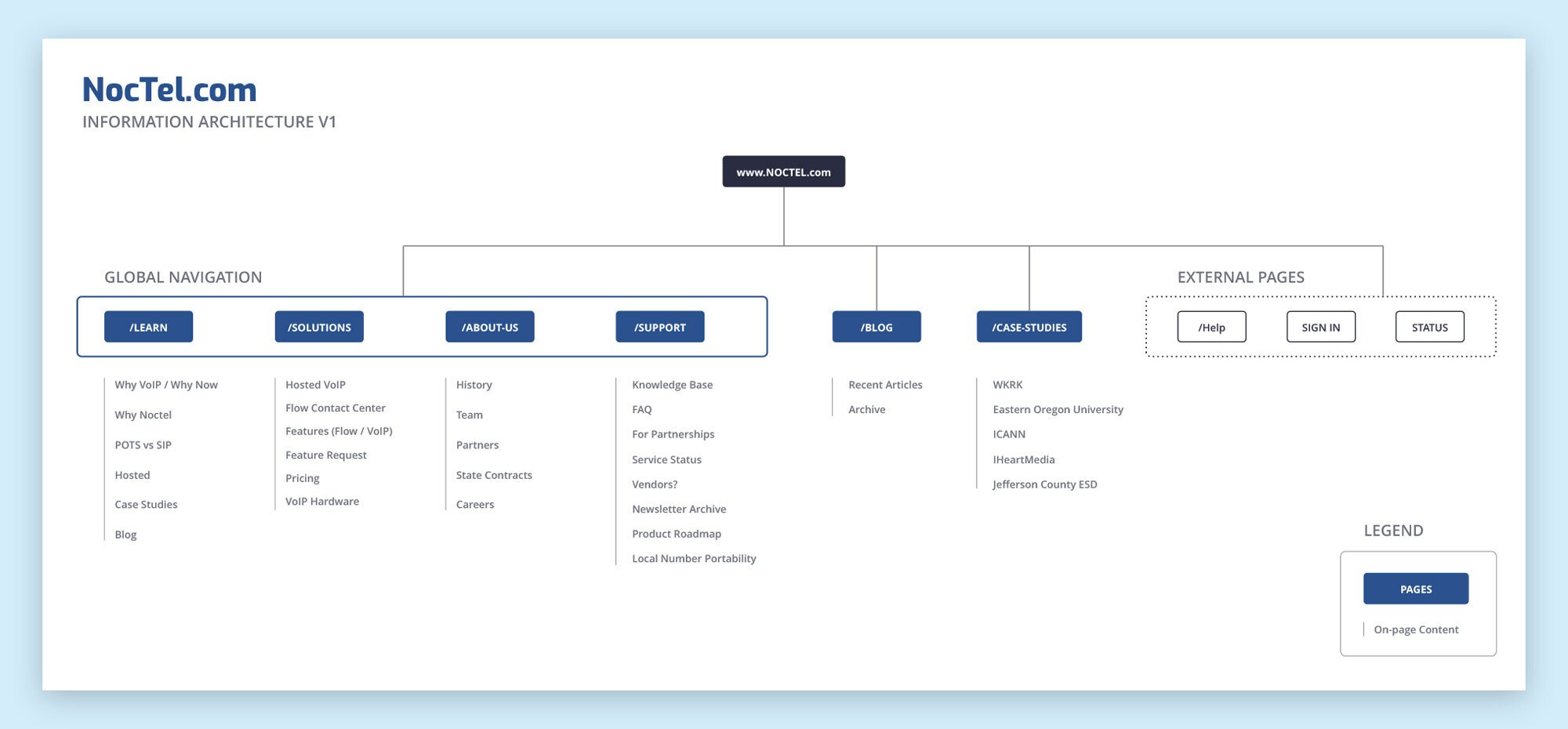
Sitemap + Content Audit
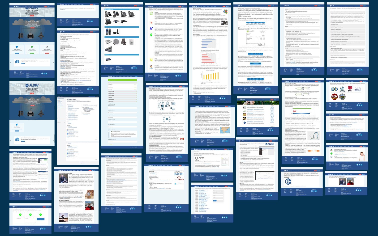
The kickoff meeting for this project covered the goals for the project as well as served as the beginning of the Discovery phase. In the meeting we scraped through a content audit of the site in order to determine what content should be kept, killed, or created for the new site. We also covered the first draft of the site map to get a clearer perspective of the information architecture of the new site. As creative director on the project, this helped me move into the wireframing process while also allowing our development team to get a head start on laying out the back end of the site. As you can see from the screenshots of the old NocTel website shown above, they drastically needed to reduce the amount of text being used and introduce additional sources of visual interest.
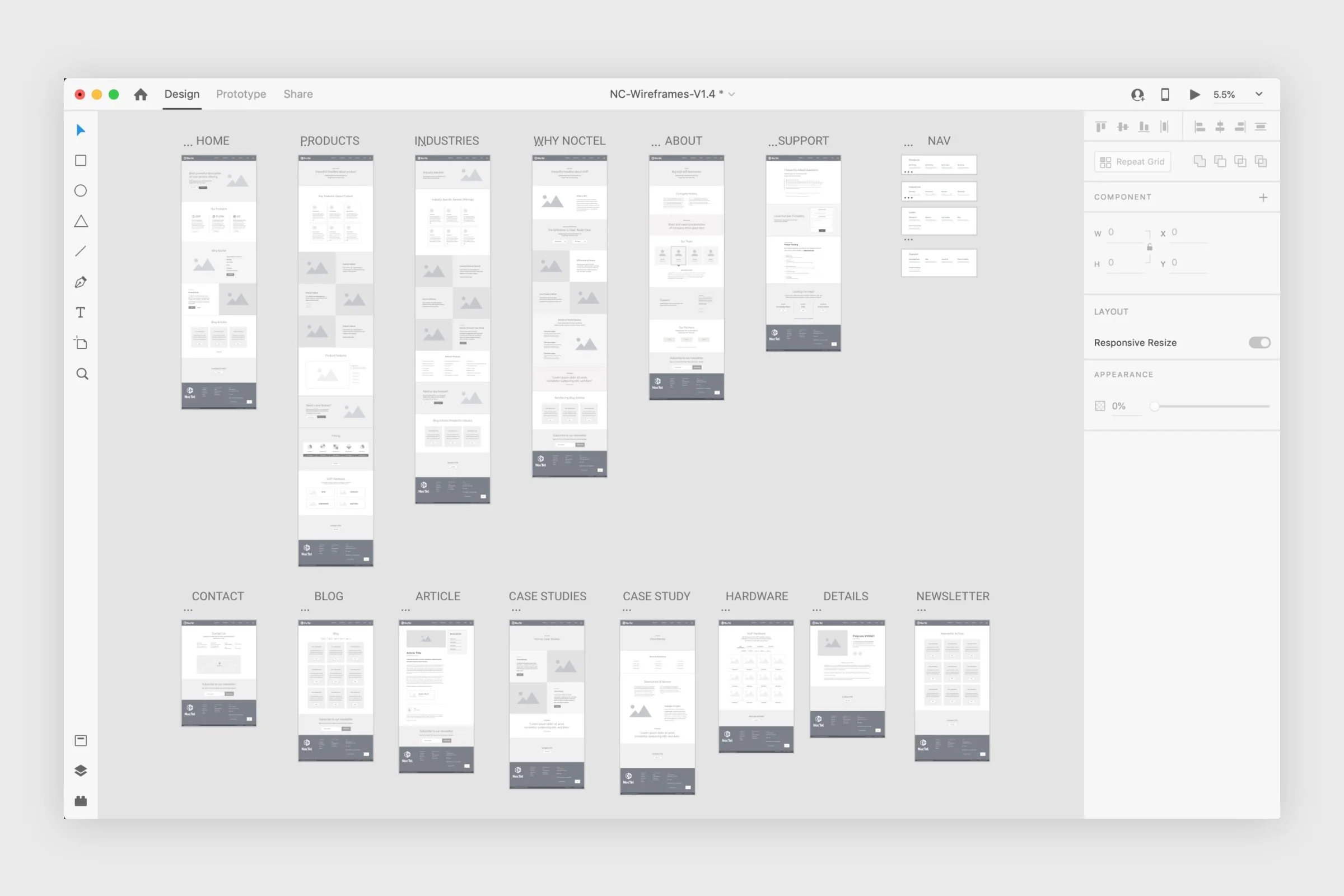
Wireframes
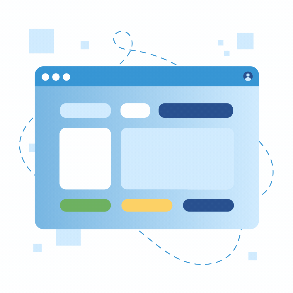
I leveraged the final sitemap to translate each block of content and used Adobe XD to produce the wireframes for the new site. This was helpful because it allowed our team to quickly share iterative concepts for each page and the entire site without the need to export hundreds of concept files. We utilized the cloud-based review links for internal use and during client reviews so their team could navigate a low-fidelity version of the site instead of having to thumb through a giant PDF or a folder full of exports.
Once the client gave us the thumbs up on the final wireframes, we officially closed the Discovery phase of the project.
Stylistic Choices
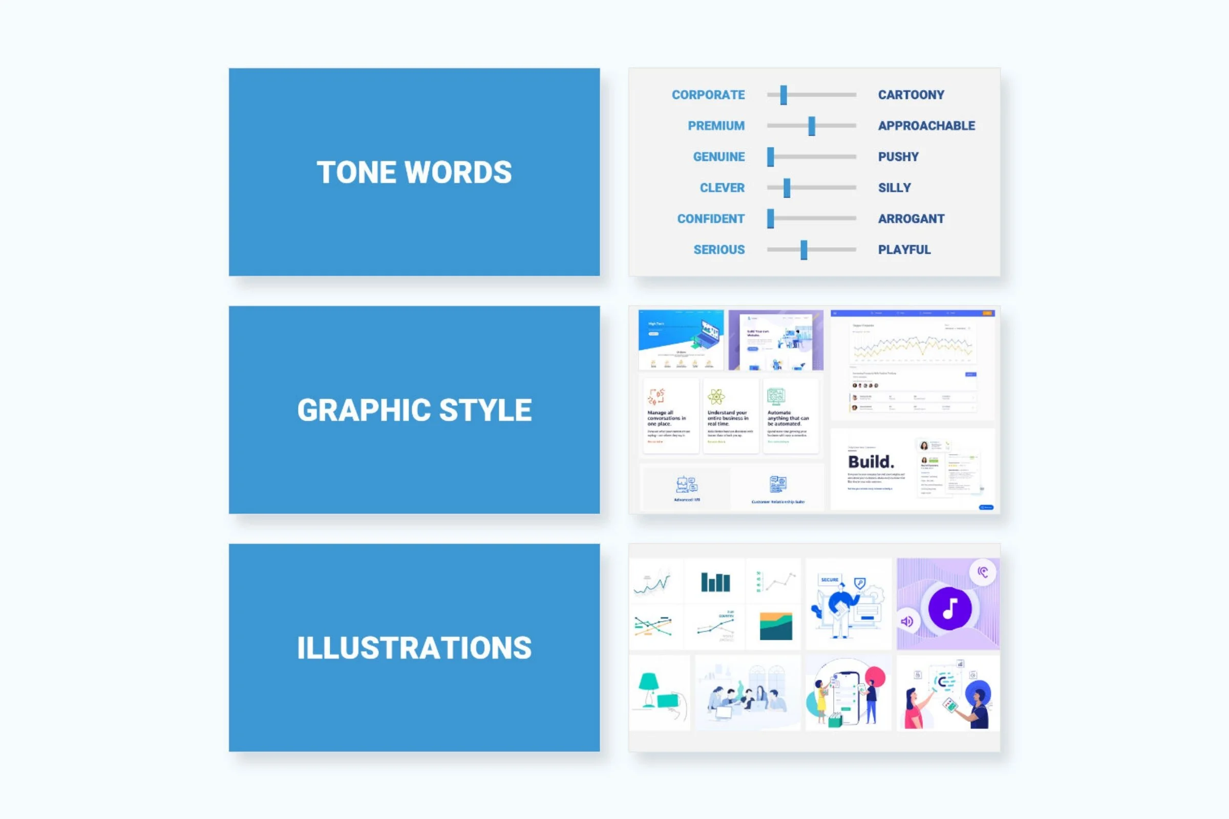
After the Discovery phase came the Design phase. This included gathering inspiration from current industry trends, competitive analysis of other businesses in their industry, as well as taking a look across multiple industries to see what stood out as something we could apply to this project.
After gathering inspiration and sharing internally, I put together a small presentation that outlined our thoughts on the design approach and held a meeting with the client to communicate our findings. First we covered a handful of tone words that helped both teams align on a shared vision before exploring a variety of graphic elements such as component styling, illustrations, and iconography. The old site was a dark and outdated relic of longform text, odd illustrations, and stock photography. With this in mind we recommended a light and clean approach to the UI combined with playful yet professional graphics that reflected NocTel’s approachable style of doing business. We received great feedback that ultimately led to an approval of the recommended approach.

UI Design
After designing the new home page of the site using the recommended design approach, I walked the client stakeholders through the design in order to get approval before continuing on to the rest of the site. I continued to design each page across several breakpoints to ensure a great user experience for mobile, tablet, and desktop users. Many of the blocks on the site were reusable components that would be leveraged in multiple ways. I worked alongside our dev team to determine requirements for these blocks to reduce redundancy during the design phase and to allow for flexibility once the blocks were developed.
Content
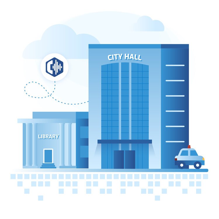
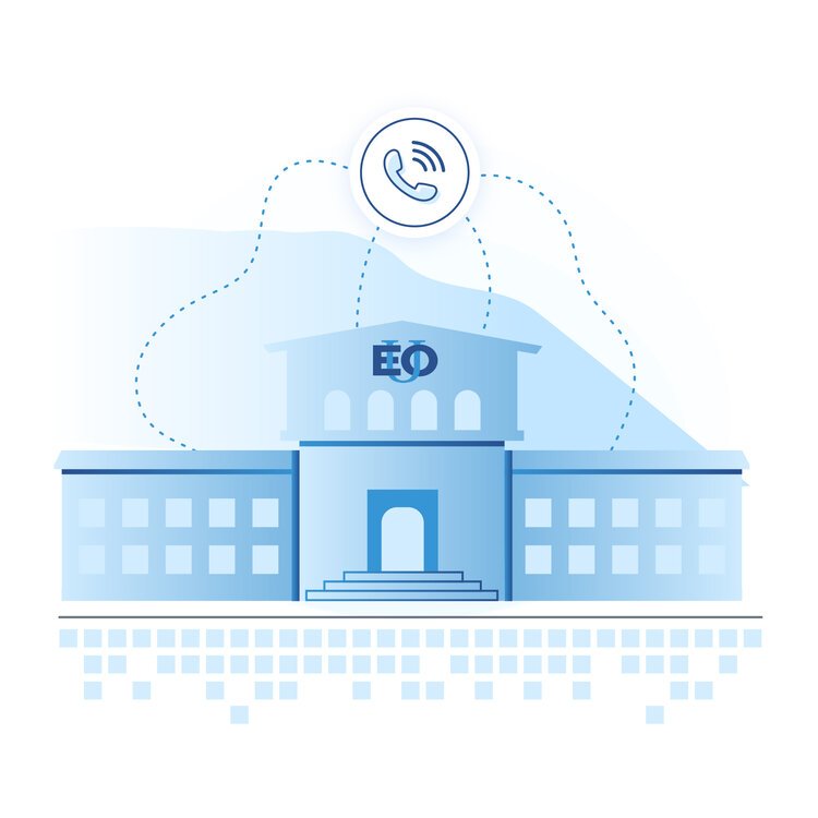
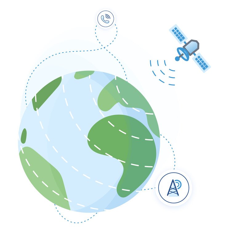
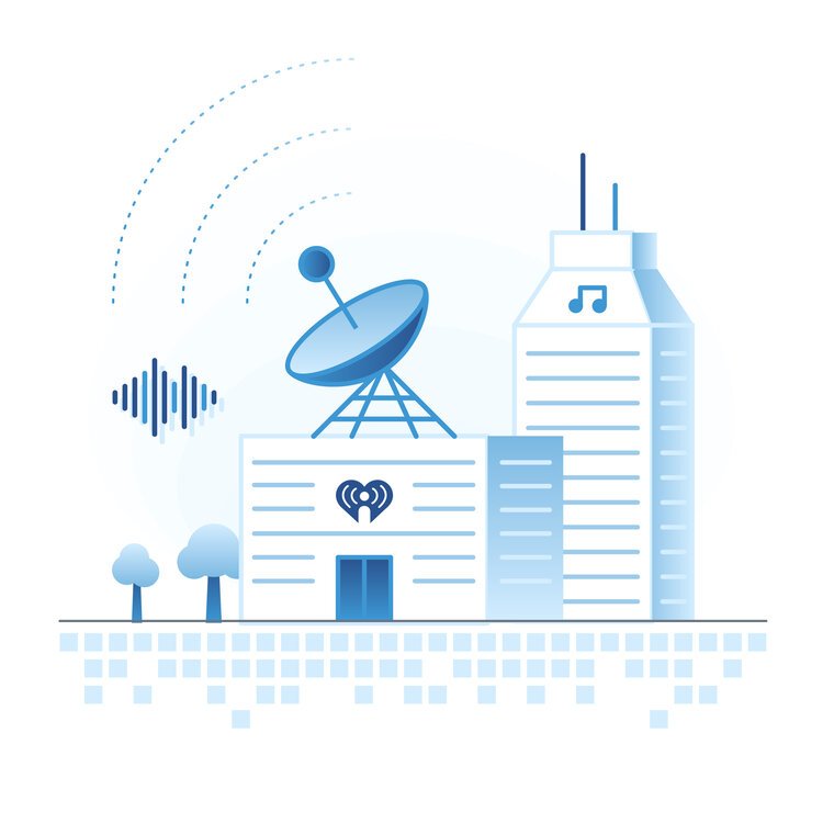
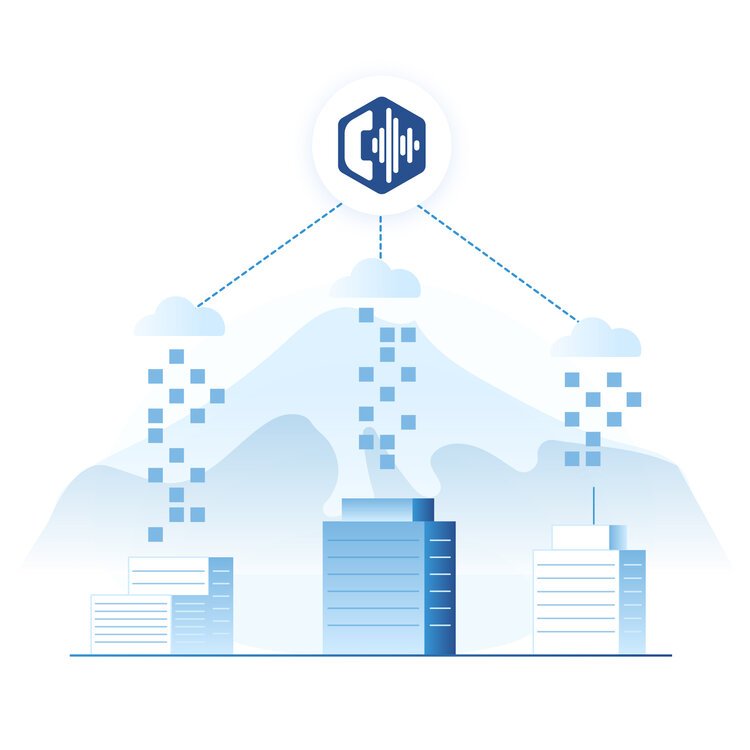
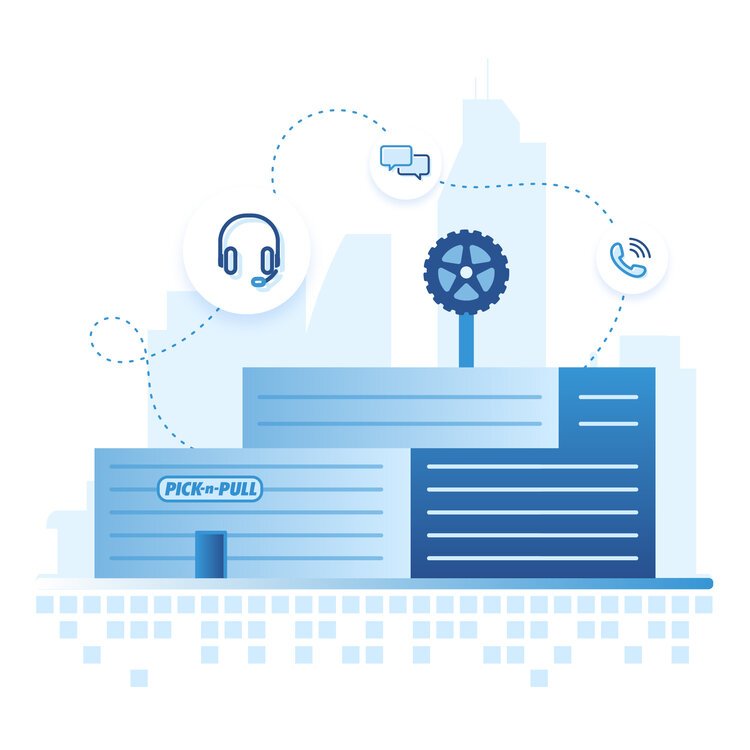
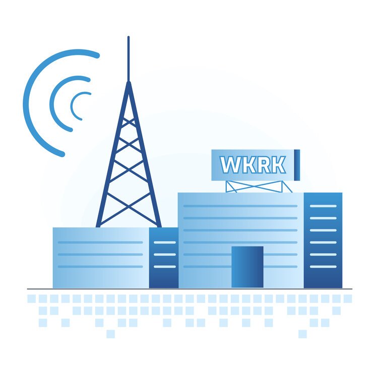
One of my favorite aspects of this project was our ability to provide the client with new content across the site. Our recommended approach was to use playful yet professional illustrations as well as add a subtle layer of motion in some areas to bring the graphics to life and draw in attention. I created multiple illustrations that helped demonstrate their products and services as well as served as the artwork to represent their case studies.

Animation
Finally, I took some of the illustrations and brought them into Adobe After Effects to add subtle bits of animation. We then leveraged the Bodymovin JS framework to place the animations on the site without the need for heavy GIF files that would slow down page load speeds. Since our team leveraged Craft CMS for this project, we had the ability to customize the backend of the site in order to allow the client to upload photos, videos, or the Bodymovin javascript files. This set the client up for success since they could theoretically add more animations in the future and not be blocked by the need for our development team to custom code ad hoc animations into the site.

Development + Launch
As the majority of the blocks were getting close to being finished by the development team, we introduced the client to the staging server so they could explore the site, poke holes, and expose any issues that would need to be addressed prior to pushing the site live. We utilized a live collaborative document to address feedback and requests from both teams in order to tighten up any last remaining tasks before polishing it up for final approval.
Once the site was complete, our dev team held a training session with the client to make sure they were comfortable navigating and making changes to the backend of the site. Once all team members from both sides were happy with the final result, the site was pushed live!

Awards
I thoroughly enjoyed collaboratively working with NocTel on this project. Our team enjoyed the process and outcome so much that we decided to enter the final website into a few award shows including the Communicator Awards and the AVA’s presented by the Academy of Visual Arts. We ended up winning several awards from both shows including a platinum award which is the highest award offered from the Academy of Visual Arts.
I enjoyed the challenge of being involved at every stage of the process for NocTel’s website redesign. The client was very open and receptive to the recommendations made, while also confidently voicing preferences that weren’t always the original approach but ended up making a better final product. Plus it’s always nice to wrap up a project with a handful of awards to back up a job well done.